
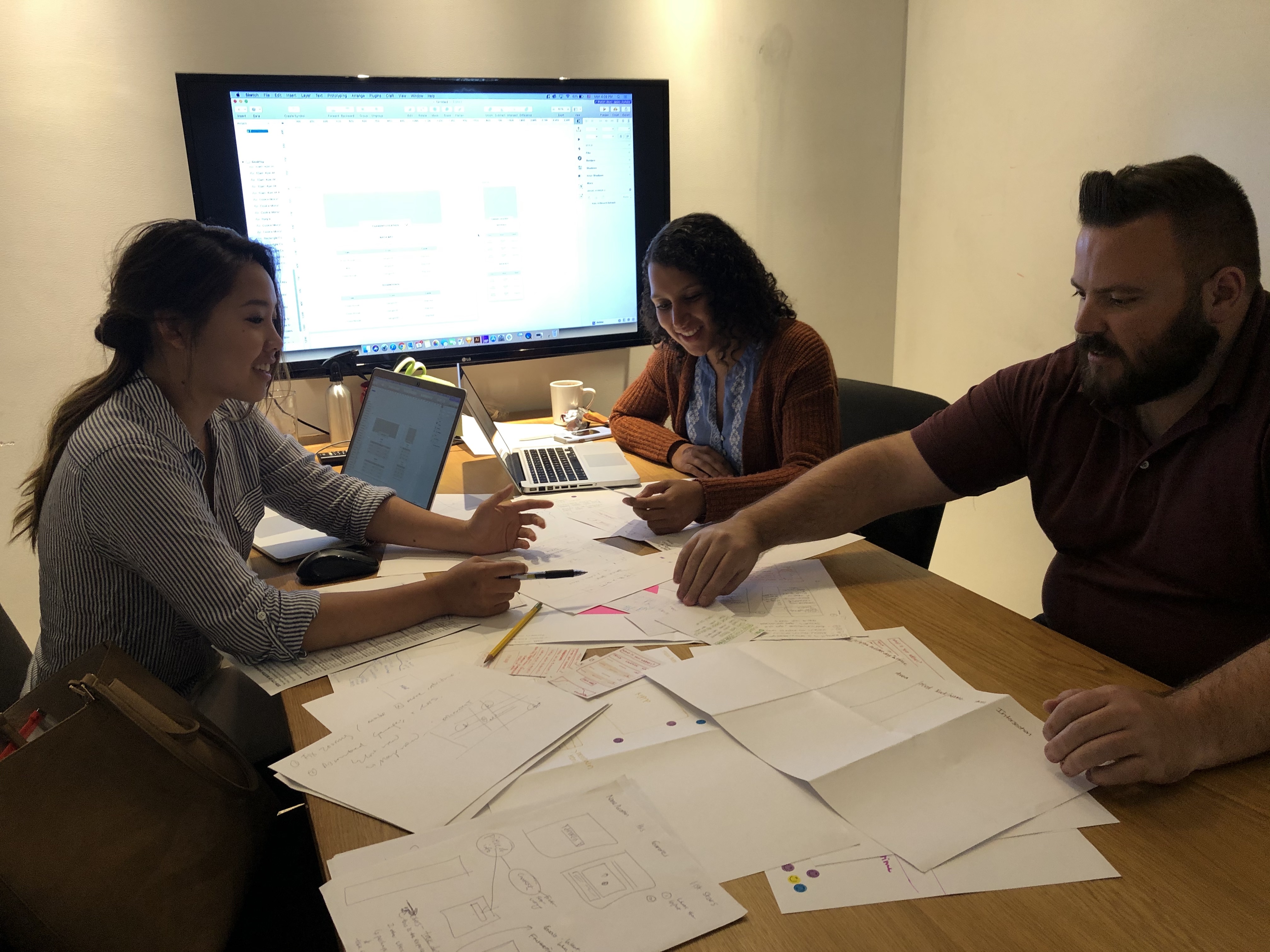
As the Project Manager, I led a team of 3 UX designers to create a data visualization strategy for location-based data on Boston.gov.
City of Boston
3 week design sprint
Sketch, InVision
User Research, Wire framing, Usability Testing, Hi-Fi Mock Ups
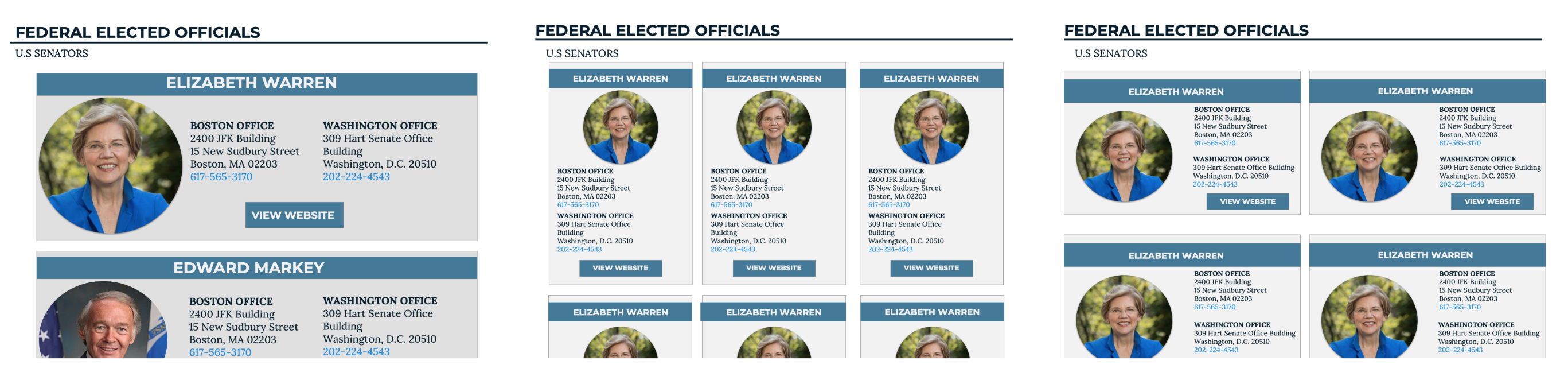
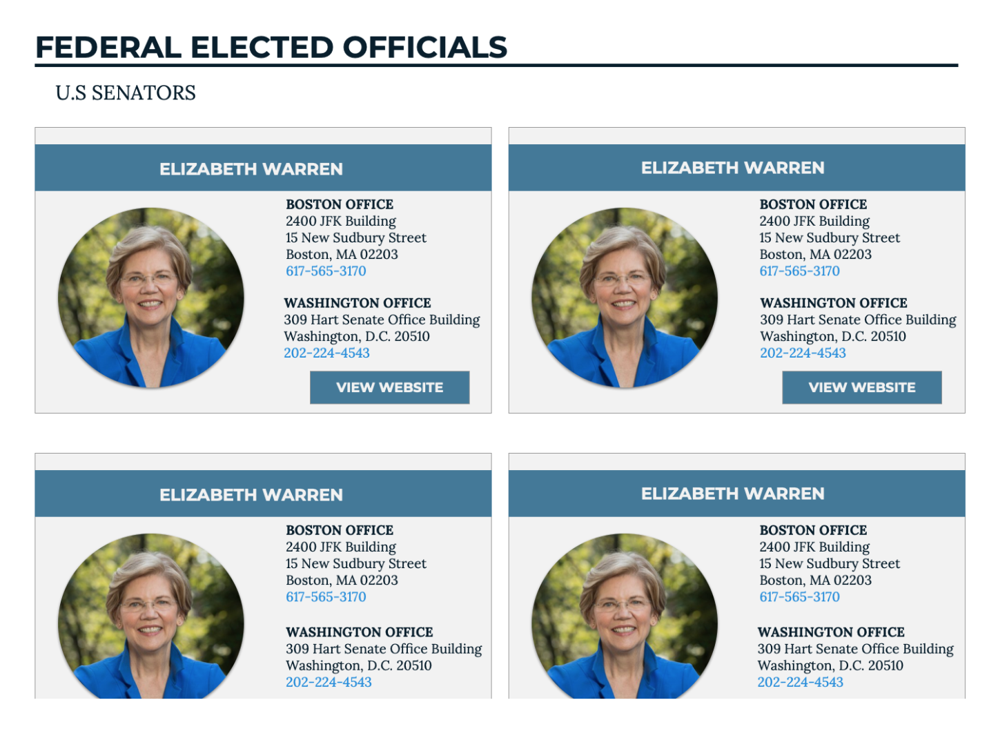
Boston.gov holds a lot of information about Boston, with about 150 datasets presented in tabular form. As the city of Boston transitions through their rebranding, they wanted to evaluate the best practices on the use of tables to display information on mobile responsive websites. When is it too much? When is it necessary? When should it be something else?
Meanwhile, task driven users of Boston.gov need a way to access the information they seek within tabular data in a more readable, intuitive, and organized manner.
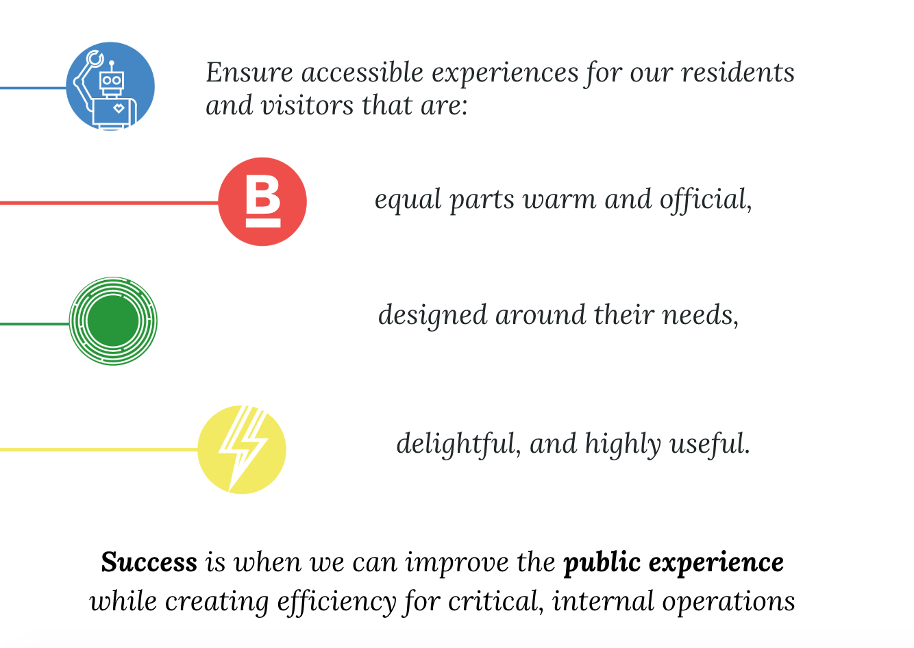
The City of Boston's DoIT team was a unique client to work for, as the metric for success was not by sales or revenue, but by the public perception, which is hard to quantify. During our kickoff meeting, we identified our client's priorities to be:
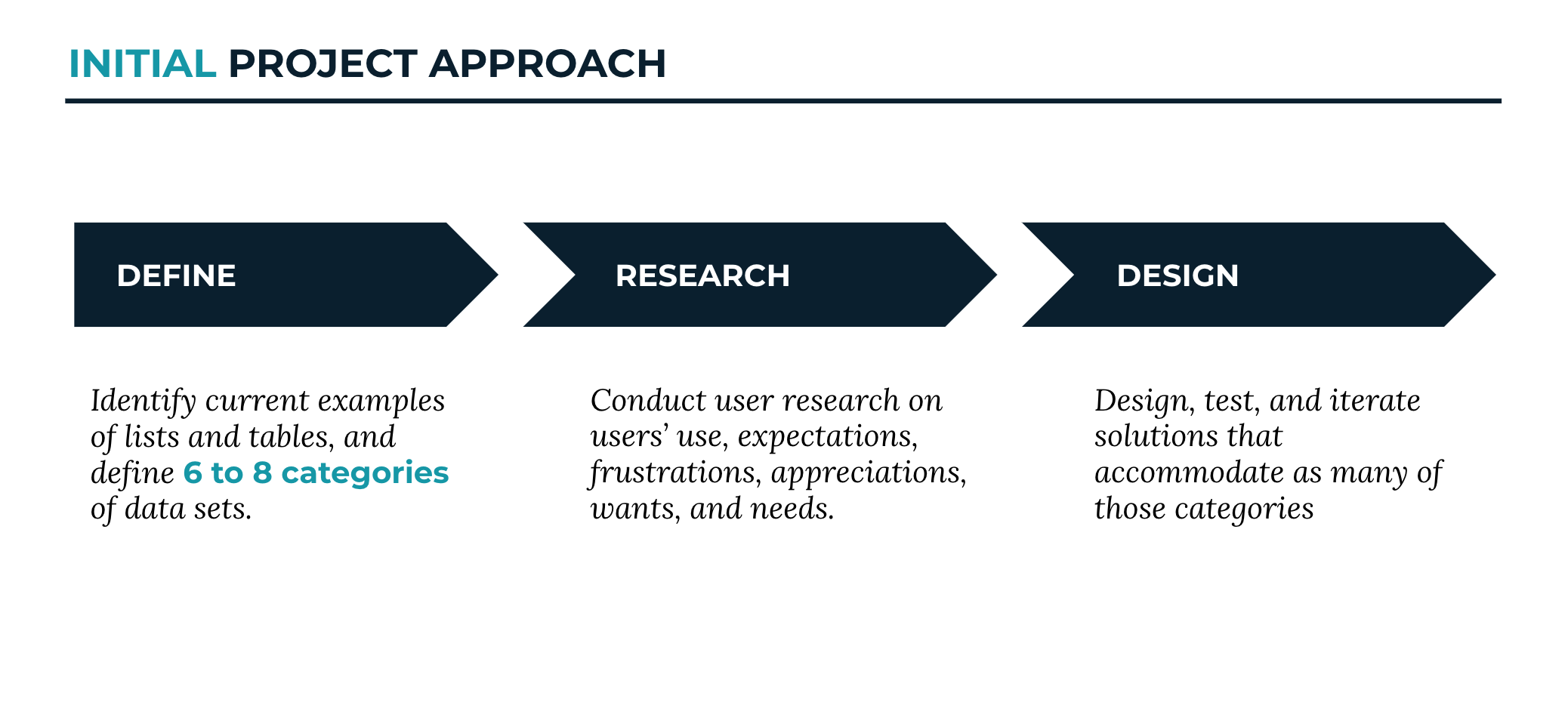
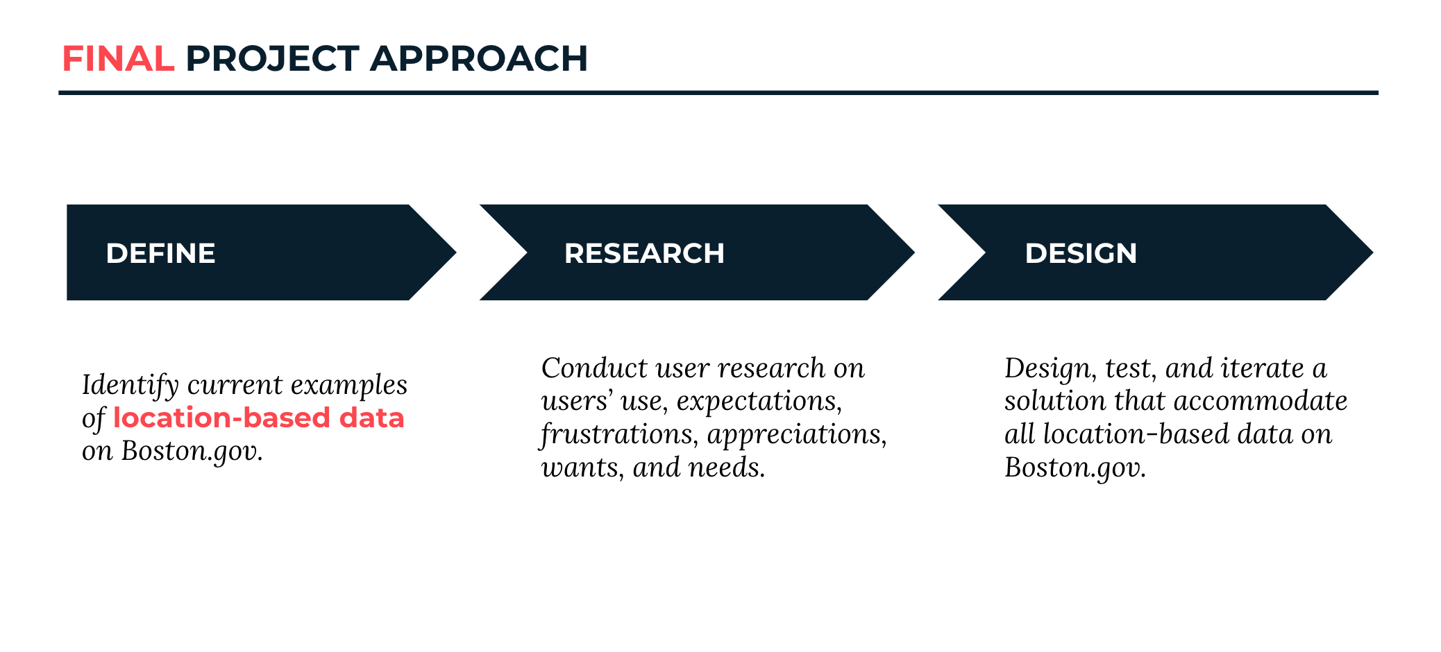
At first, we were dealing with a very wide range of went through a few revisions of our project scope, which affected how we wanted to approach this problem.
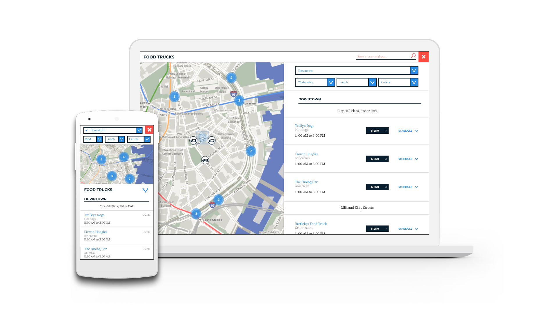
We identified 3 different types of users of Boston.gov. For this project, we focused on user type 3 - the task driven user. The client expressed an interest in learning more about this user, specifically relating to how they look at location based data.
Loves tables, gets information about Boston from API for business reasons.
Gets information mainly on Boston.gov, sometimes from Analyze Boston to get specific information.
Has an input, expects a specific output and interactivity between map and list.
To start our research process, we looked at how location based data was being presented outside of Boston.gov through comparative analysis and heuristic evaluations. This helped us get a better understanding on how location based data is presented in other widely used sites, and what the user expectations may be.
Heuristic Evaluations: We spent some time learning from other applications where location based data was displayed well. Although we did not get their SUS scores, we knew they must be doing something either really right or really wrong. The results for the Heuristic Evaluations were pretty solid. With slight areas for improvement under error recognition, minimalist design and help, and documentation. This is something we wanted to focus on during the design process- Especially error recognition, because we wanted to avoid users leaving the site all together in exchange for google search.
Similarly in Comparative analysis, we dove in a bit deeper to notice the fine design details of what was successful. All mobile and desktop versions allowed for the user to search by location, to sort and filter. None of them had tables, but all included interactive maps.
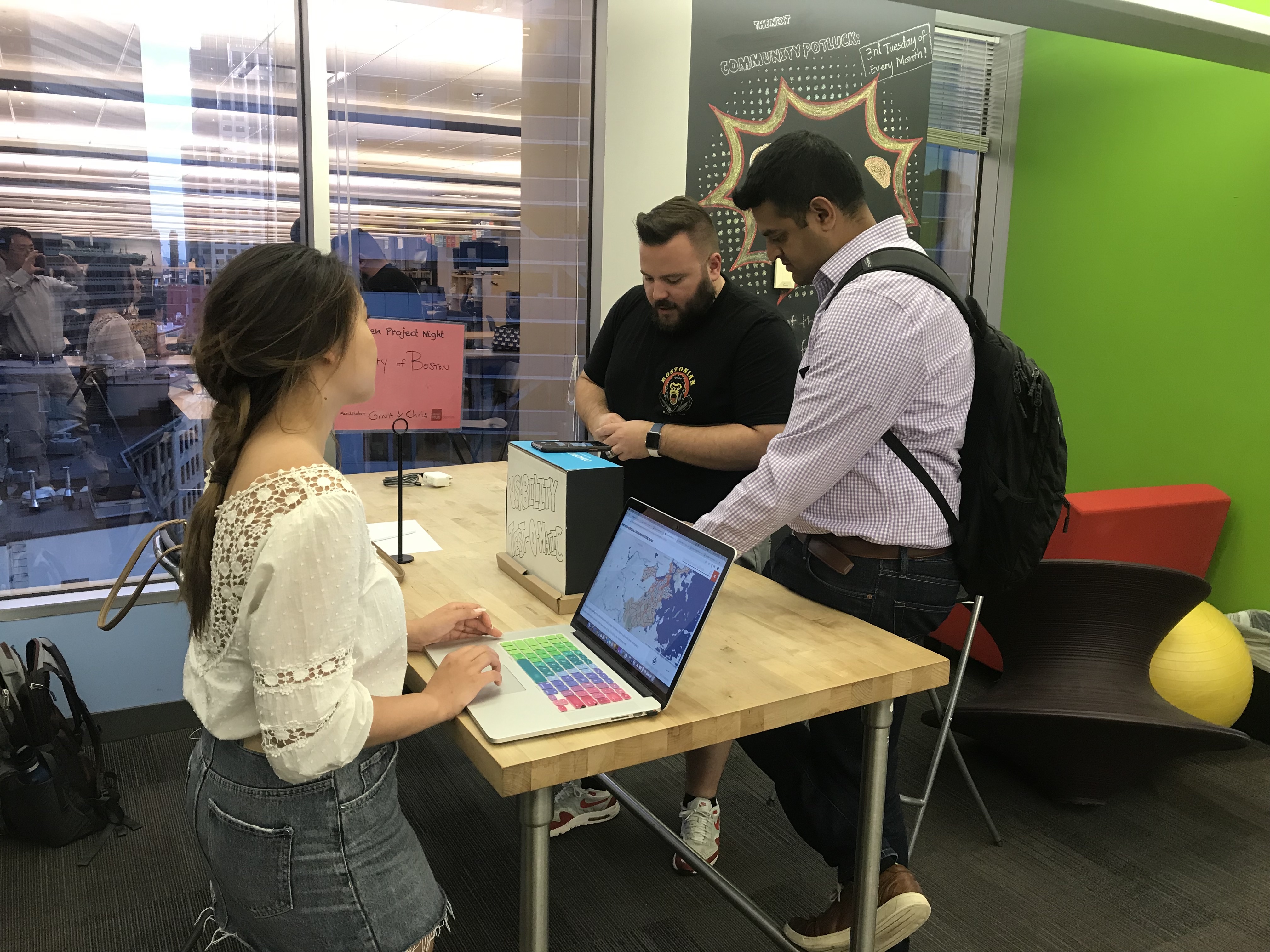
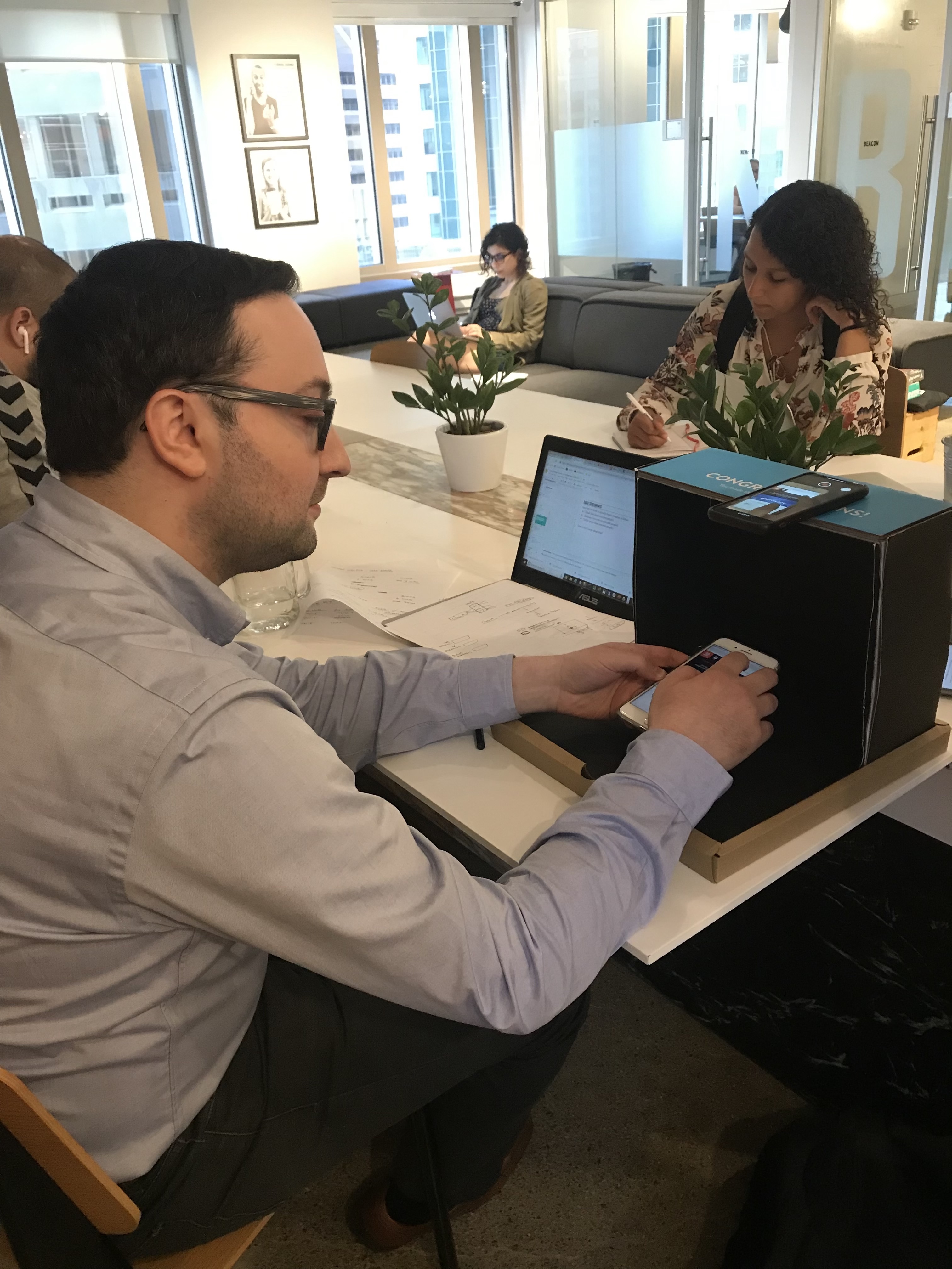
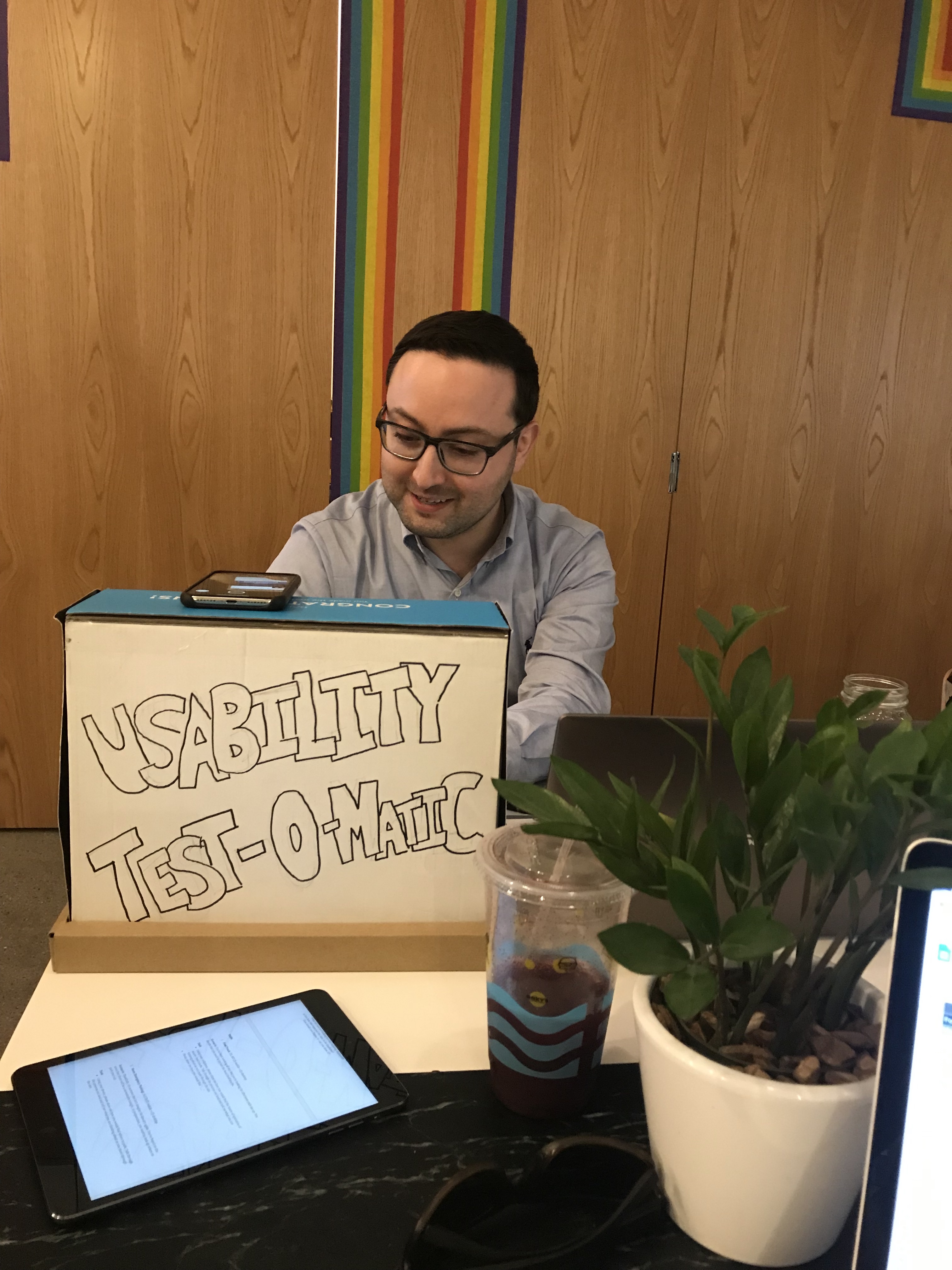
To understand how location based data was being used on Boston.gov, we streamlined different research methods into a 15 minute session to increase the volume of research in a short amount of time. The purpose of the research was to gain insight into user’s preference regarding retrieval, consumption, and evaluation of the City of Boston’s location based datasets.
Through user interviews, we wanted to learn more about the public perception of the current website.
Using google analytics, we picked the top 3 most visited pages with location based data and asked the users to complete tasks. All 3 location-based data presented their information in different ways such as lists, tables, maps, and pdfs.
We asked our users how they would like to see location based data on Boston.gov and how they would expect to see it in a tabular form.
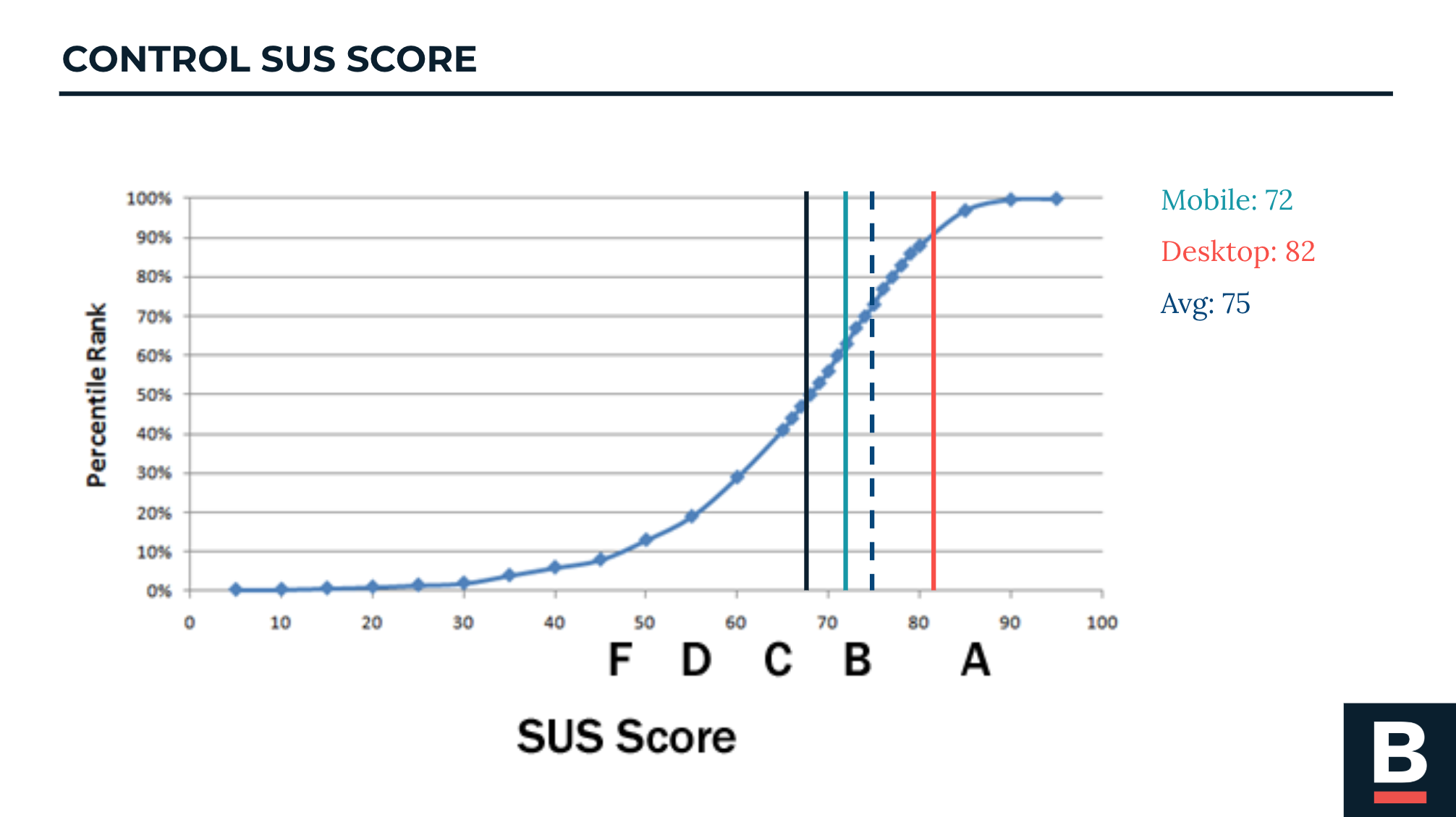
The initial System Usability Survey was used as a control to measure improvements in design.
A SUS score of 68 means that the usability of a system is above average. When we saw the high scores of Boston.gov, we were enlightened that rather than looking for a glaring problem on the site, we should look for improvement points and refinements to Boston.gov.
From our research, we learned that:
Once we got a significant amount of information about our users, we did a design workshop with our client. This activity helped us to gain perspective on what our stakeholder's expectations and goals were with this project.
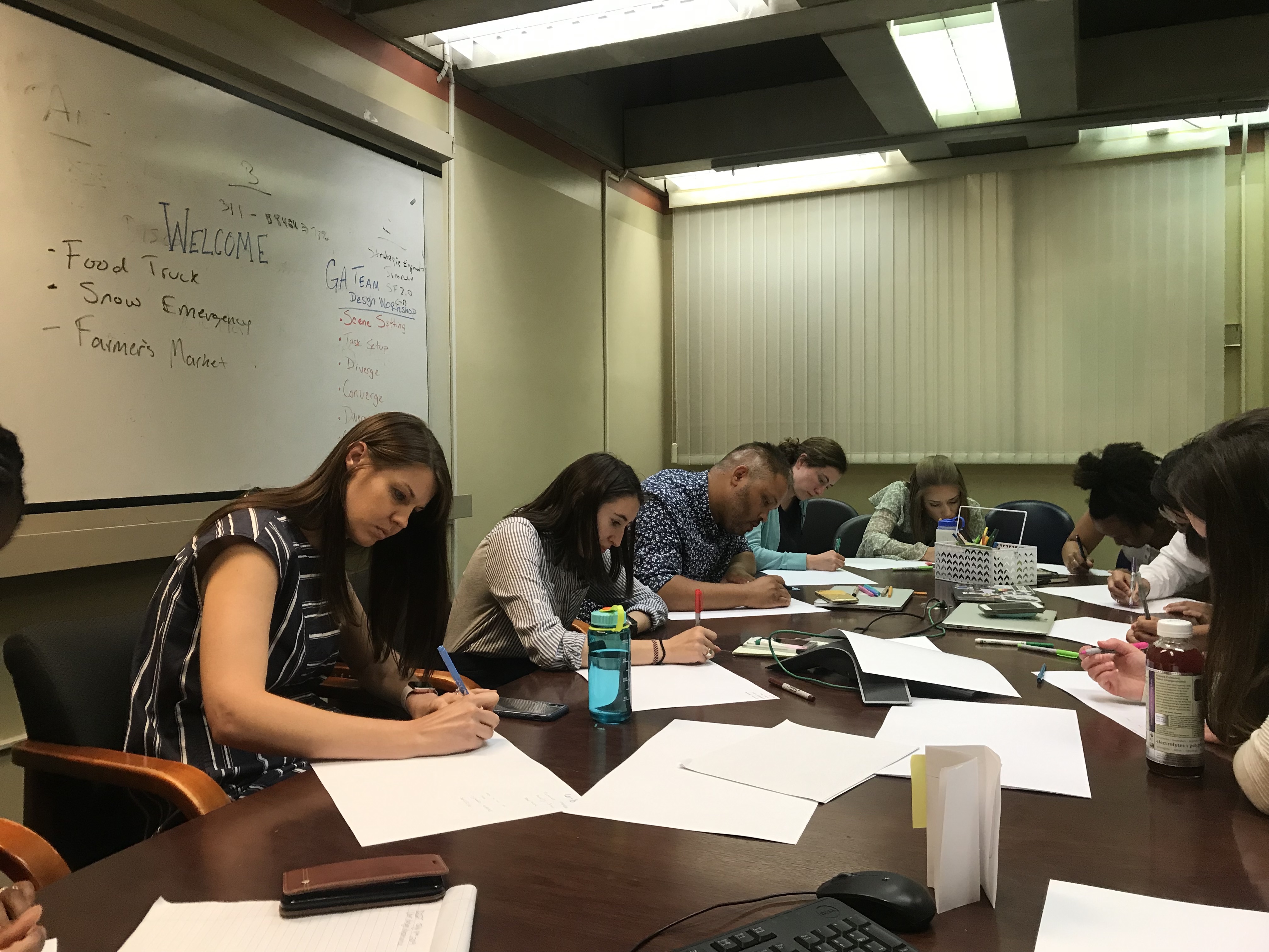
We asked our stakeholders to draw as many ways to visualize one of the location based datasets.
Many mentioned e-commerce
and real estate listings sites as good examples of how they want the information to be shown.
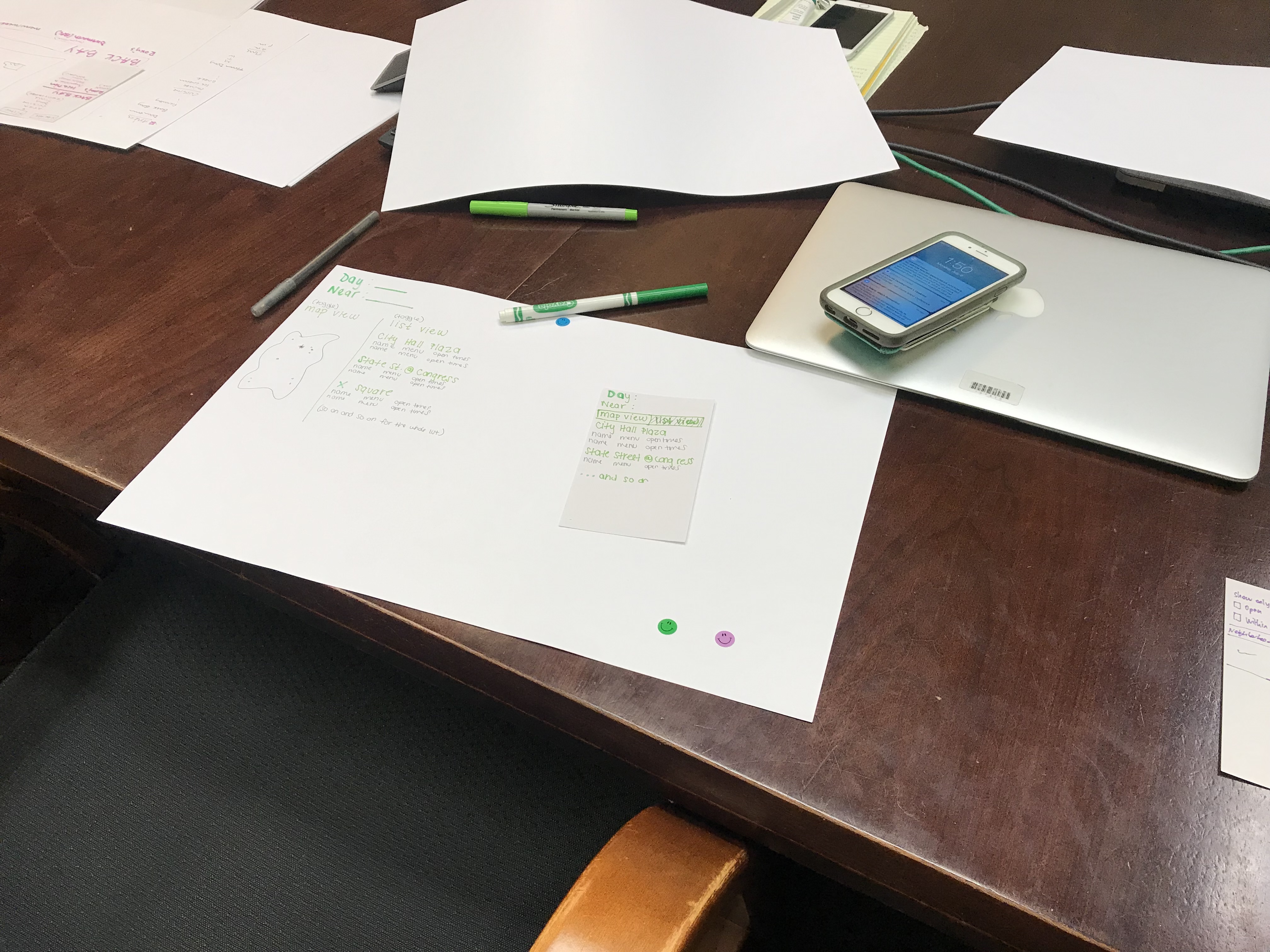
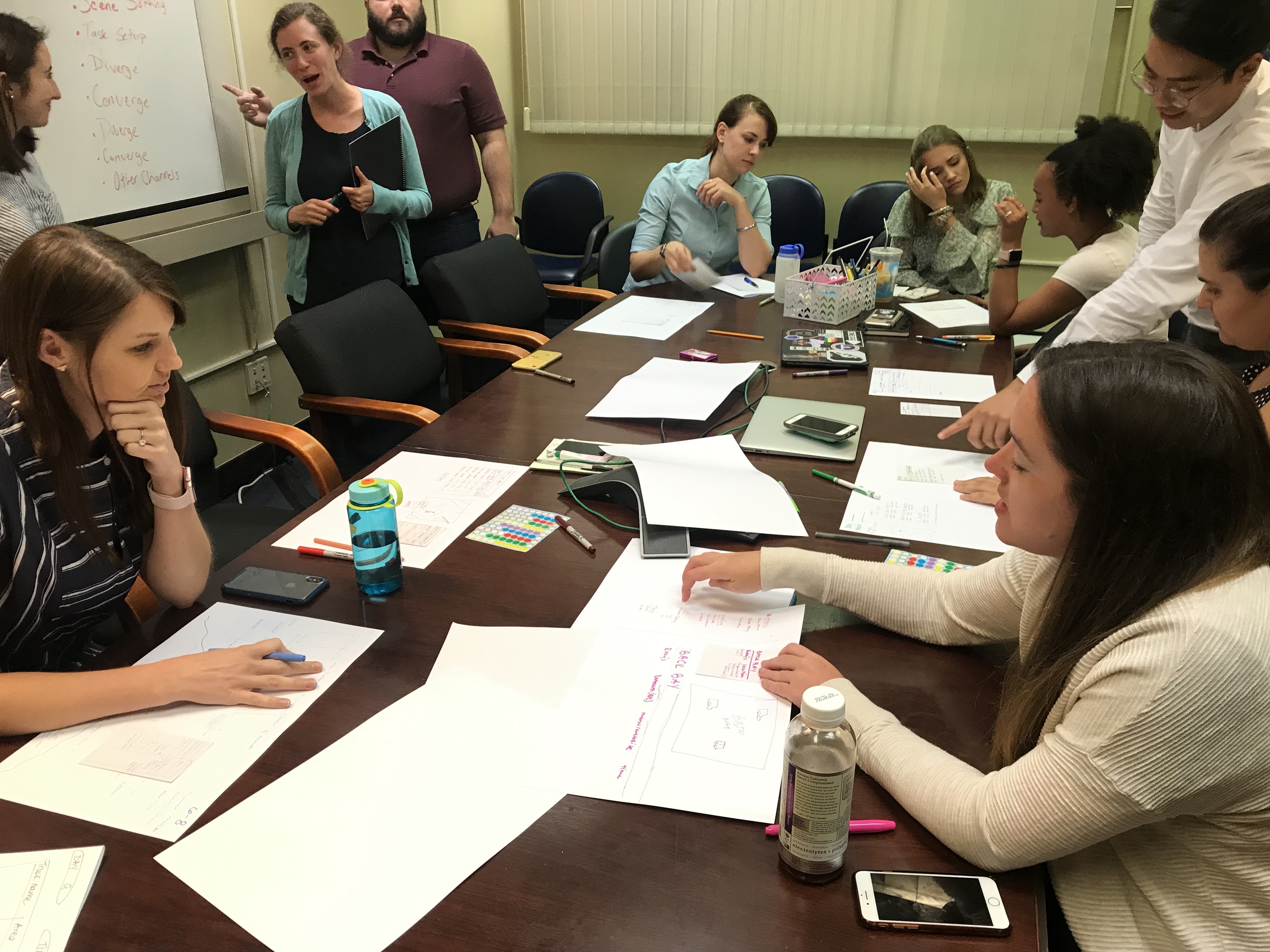
Based on the feedback and discussion, each person created one final design. Then we asked them to draw the design on a note card for the mobile version.
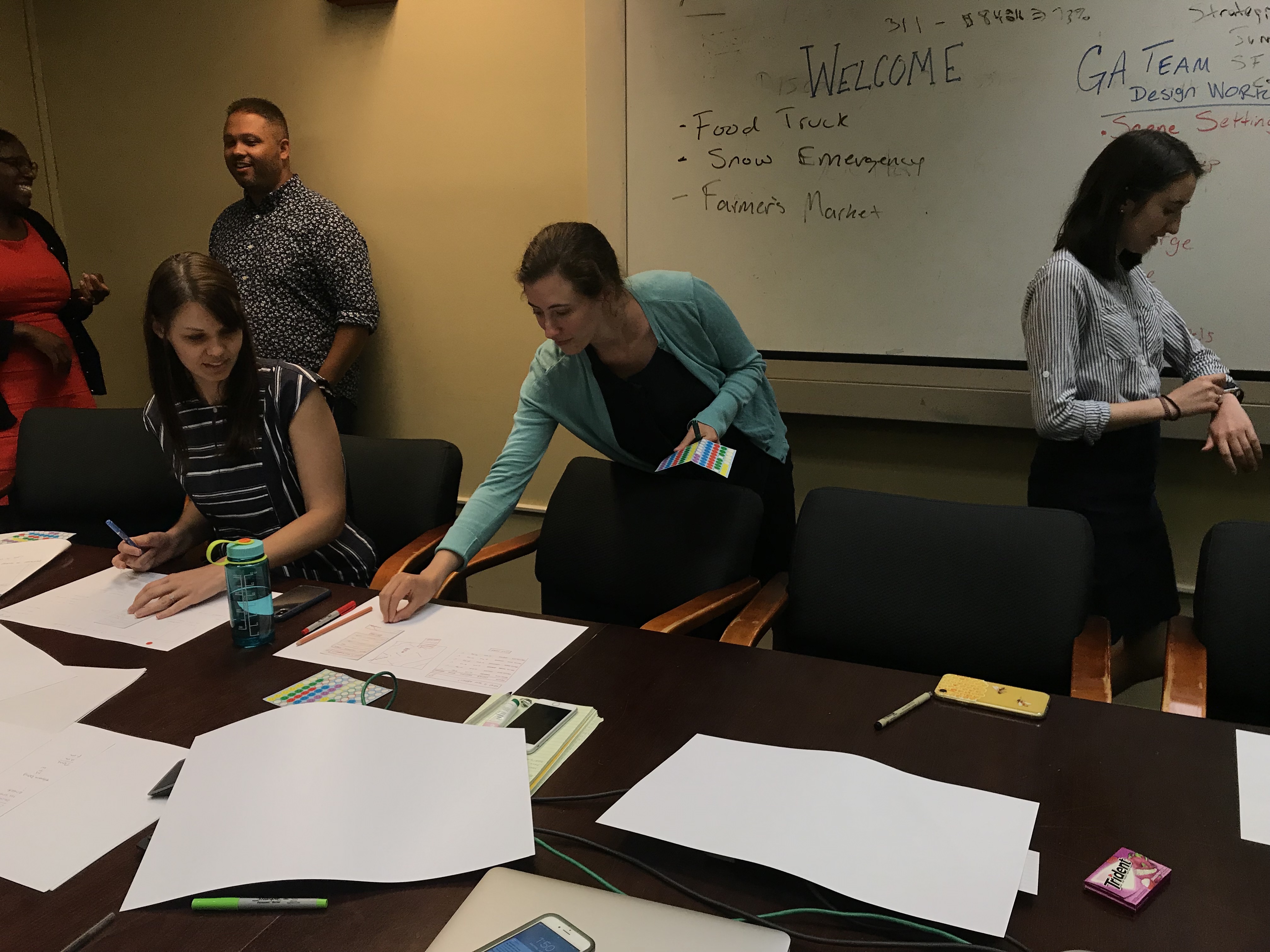
This helped determine the best designs from the group. Everyone walked around with stickers and pitch their final designs to each other.
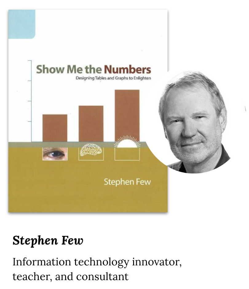
My teammates and I are not data visualization specialists. To create an effective solution, we needed some opinions. We decided to continue our research dive a little more into the expert opinions.
Stephen Few recommends that tables should be used:
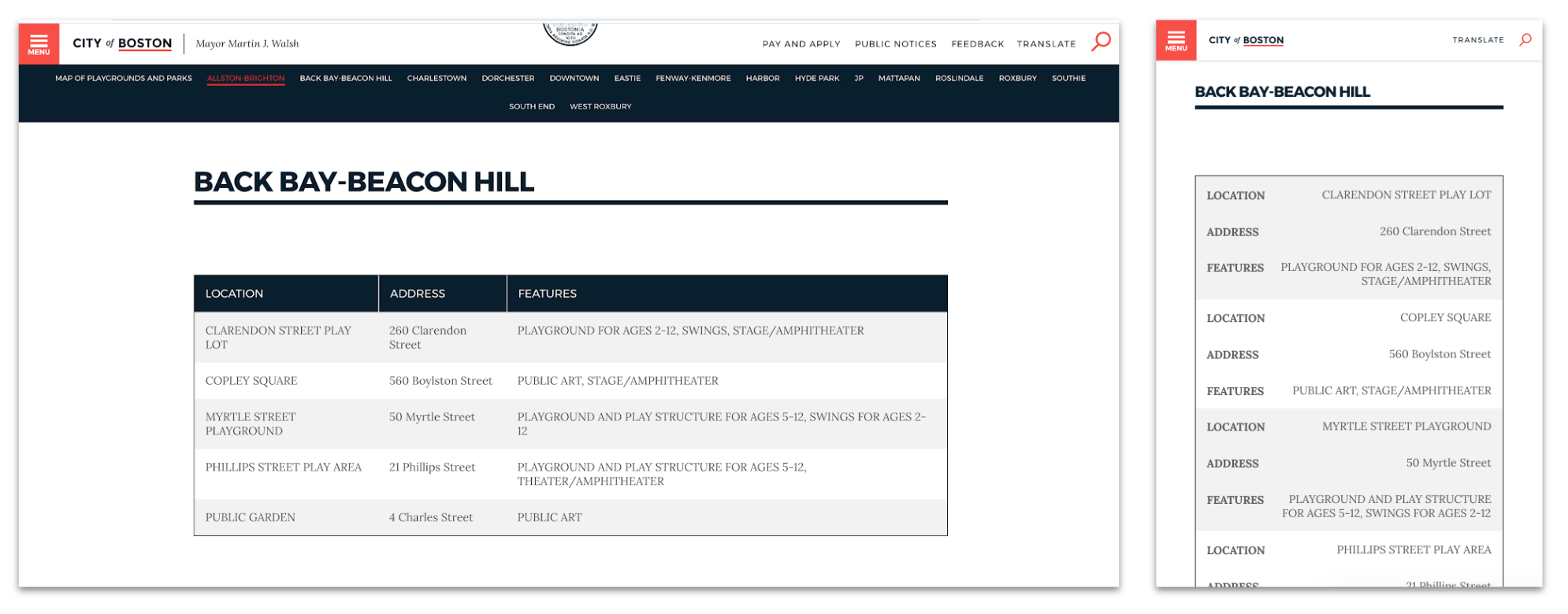
Given our client's operational and logistical constraints, we understood that implementing big changes would take time. For our first solution, we wanted a design that could be implemented immediately. We created multiple designs of tables that follow the Boston.gov brand guidelines and A/B/C tested the options.


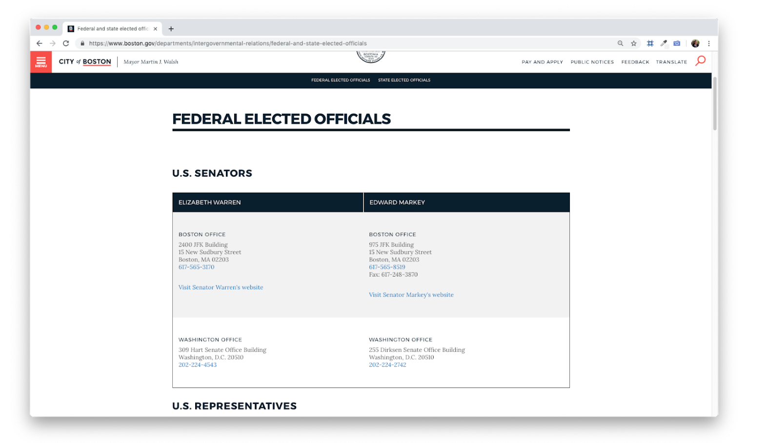
We wanted a way to translate our research and implement it to non-location-based data as well. We looked at places outside of location based data where tables are being used. We took the description based dataset displayed in a tabular format in a more visual format to improve the experience. Then we A/B/C tested the iterated designs.
Our final deliverable is designed for the most ideal scenario. For this design, we focused on:
When managing stakeholders, aligning the scope and goals of the project can be difficult. Even when things get a bit confusing, be proactive and continue to communicate.
You aren't always going to be given a major crisis problem to solve. But solving those problems can still have a huge impact on the users.
Following good UX design principles will naturally lead you to a design that is accessible.