
As a Project Manager, I led a team of 4 UX designers to improve the experience of scheduling and coordinating group tours to the Freedom Trail through the native app for National Park Service Boston.
National Park Service - Concept Design
2 week design sprint
Sketch, InVision, Adobe Photoshop
Project Management, User Research, Prototyping, Hi-Fi Mock Ups
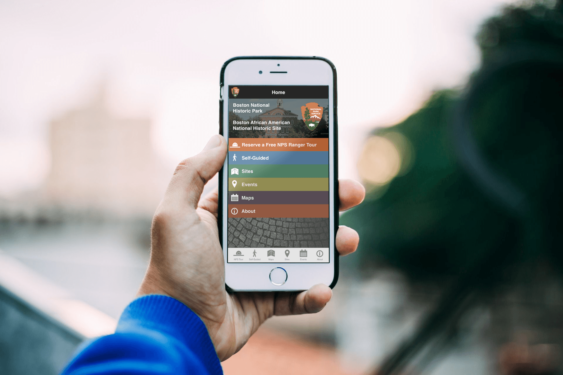
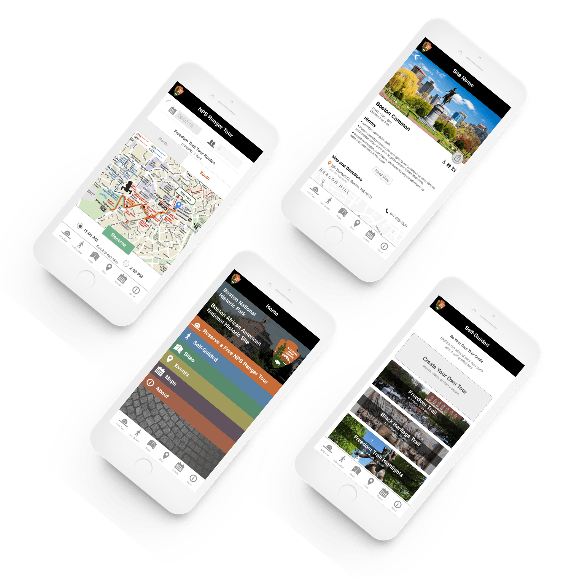
The current native mobile application for the National Park Service of Boston provides information about the historic sites, available tours, and maps of the historic park areas. The application does not accommodate planning of trips to the Freedom Trail by groups, especially those who may chose to visit only certain sites or who need to coordinate timing and locations.
Trip Coordinators visiting the Freedom Trail need an easy way to plan and coordinate tours for groups of varying sizes because the trip coordinating process is overwhelming and inefficient.
We started the research process focusing on making the trip coordinating process easier for large groups (10+), which led us to start with specific user requirements:
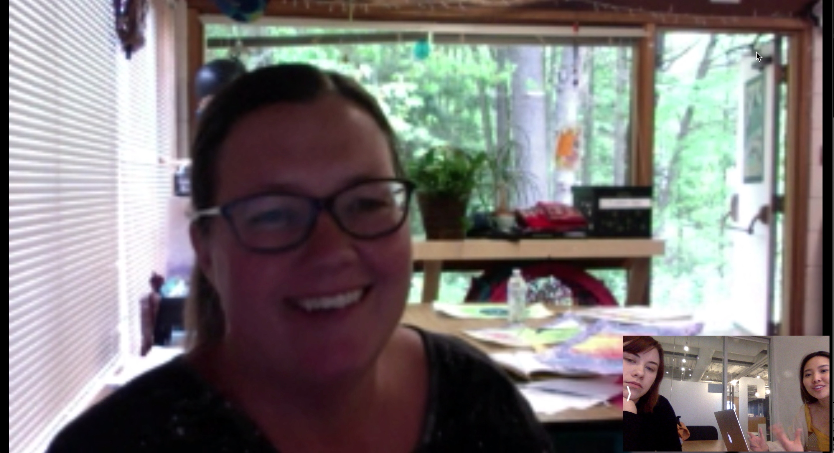
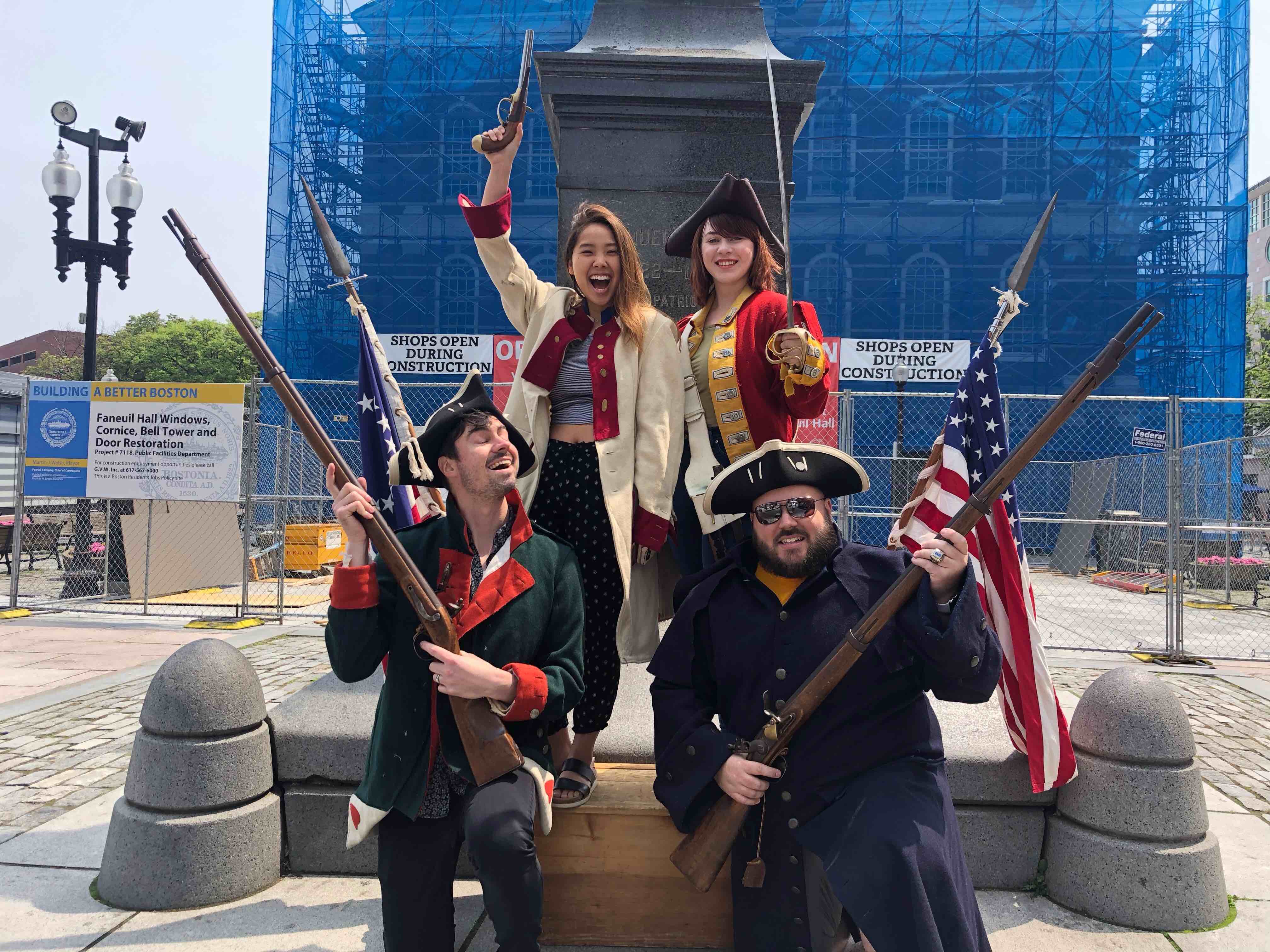
We headed out to the Freedom Trail ourselves to look for more information about our users. During our site visit, we talked do many different people who were our users, or knew a lot about our users such as:
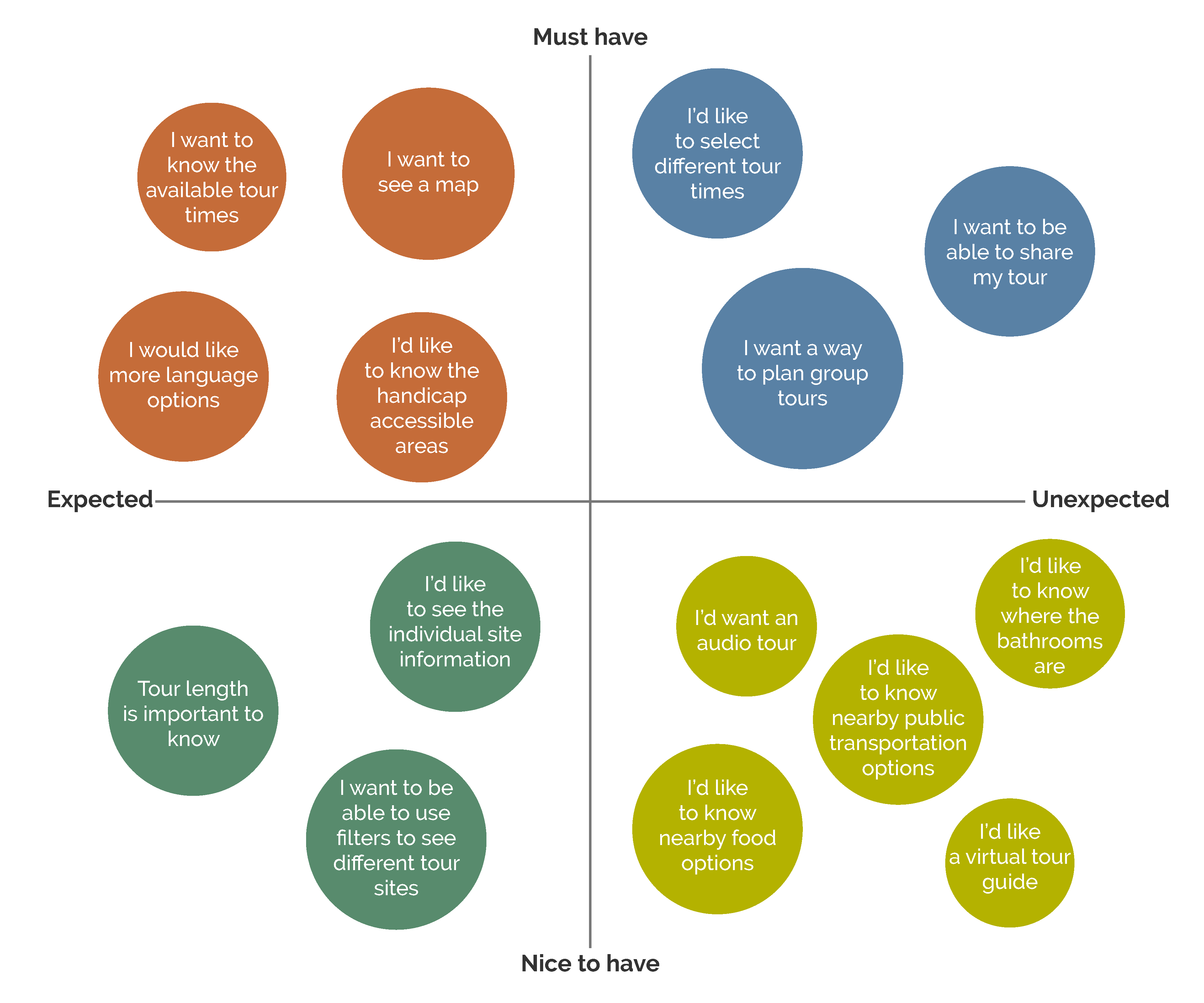
We synthesized all the information through affinity mapping, and we prioritized certain features for the application to prevent featuritis.
The existing application had useful information to help planning a trip to the Freedom Trail, but there definitely was room for it to become more usable. A lot of the information that the users wanted to see was not readily visible.
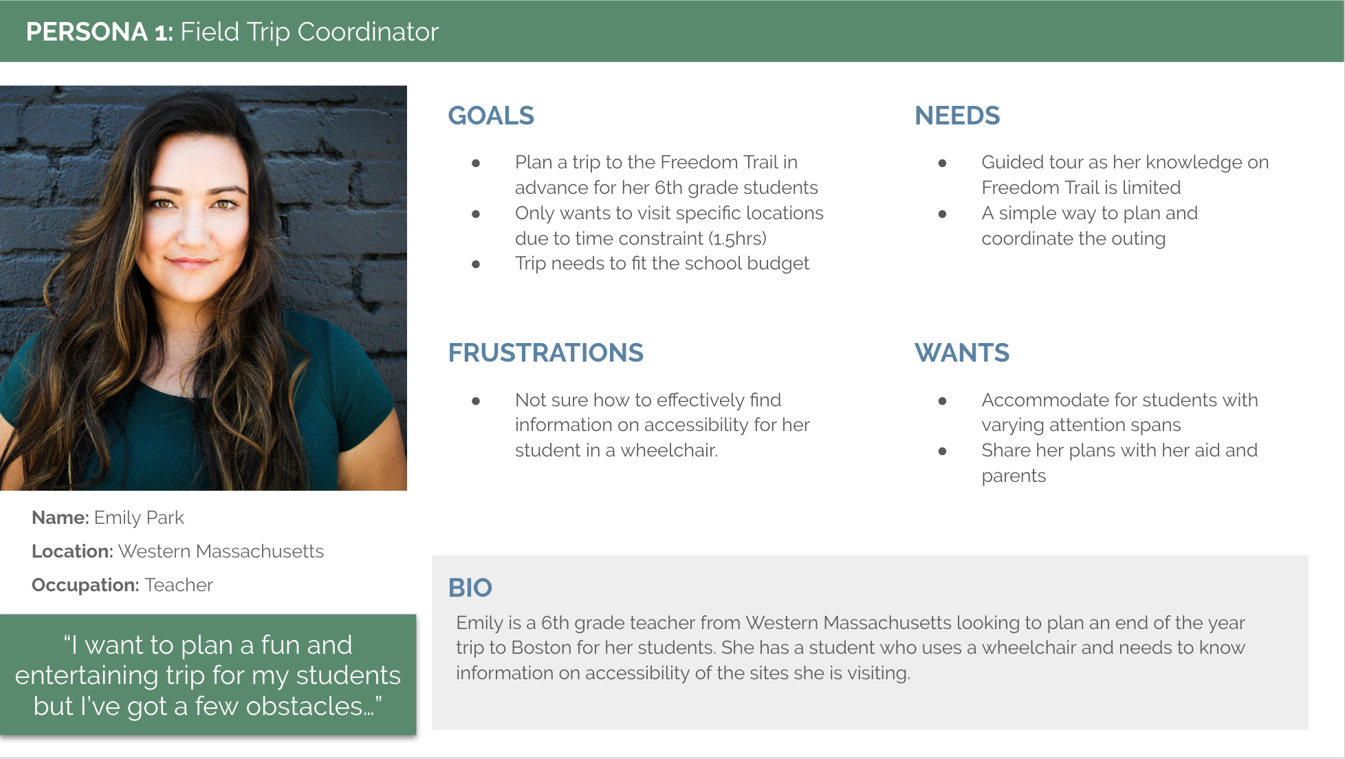
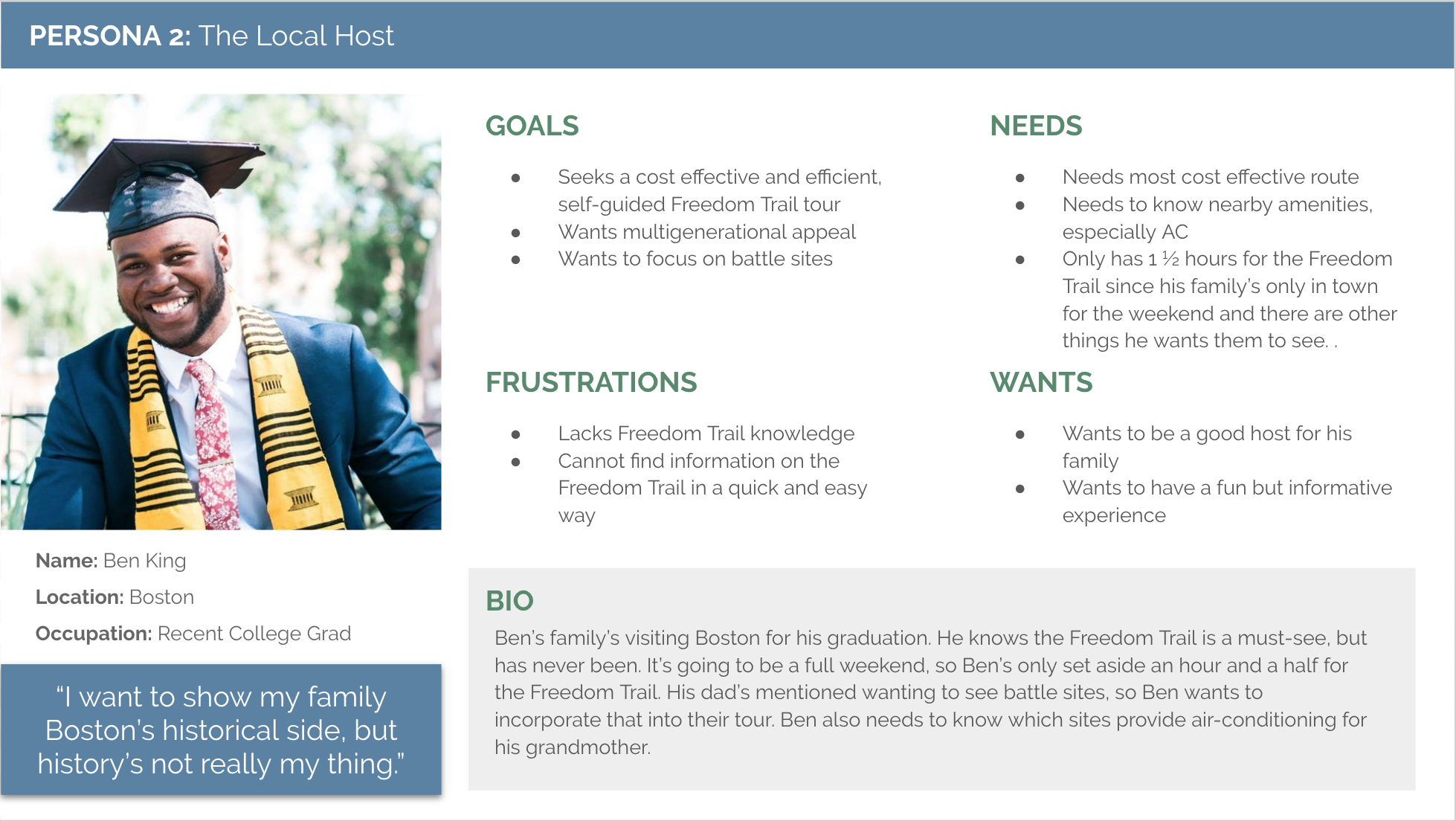
Based on the information gathered from our user research and competitive analysis, we developed two proto-personas: the field trip coordinator and the local host.
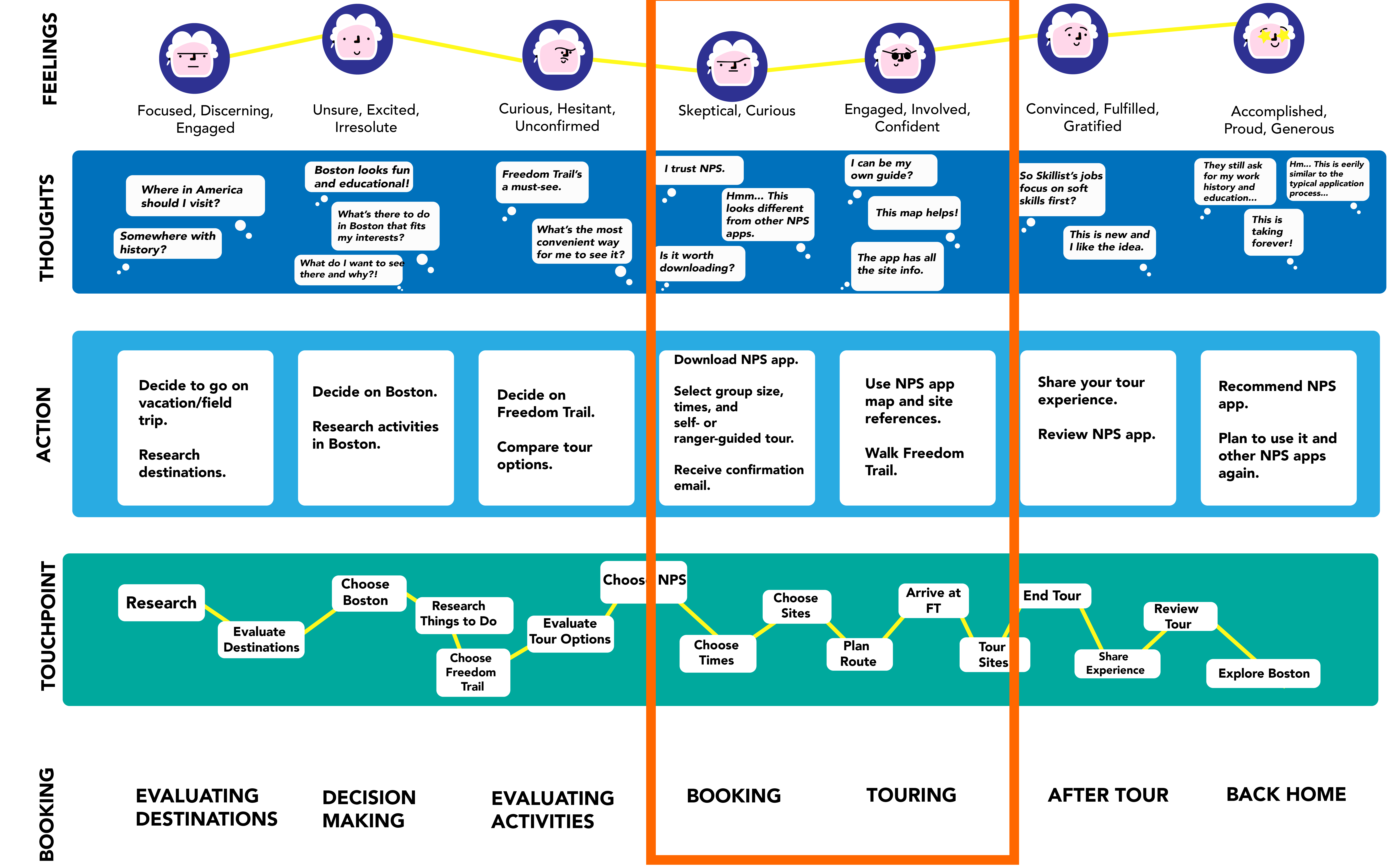
We wanted to get a better understanding of the whole experience of our user. We identified the steps, emotions and decision points the user goes through during the planning, scheduling, and coordinating process to a trip to the Freedom Trail.
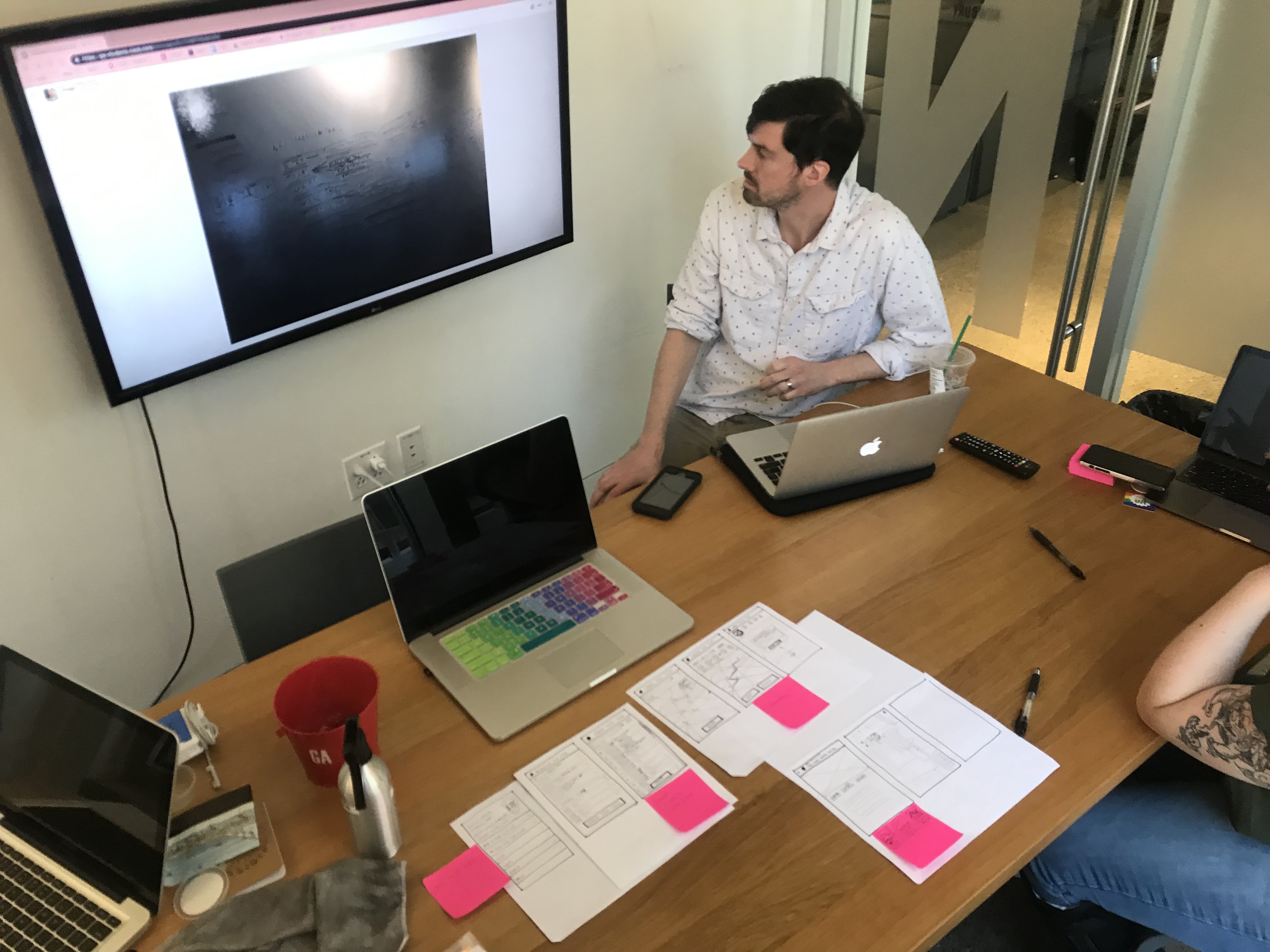
We kickstarted the design process with a Design Studio session where we focused on making the planning and scheduling of group tours easier on the NPS app. The main goal of this activity was to explore the different directions we could go to make this process more user friendly.
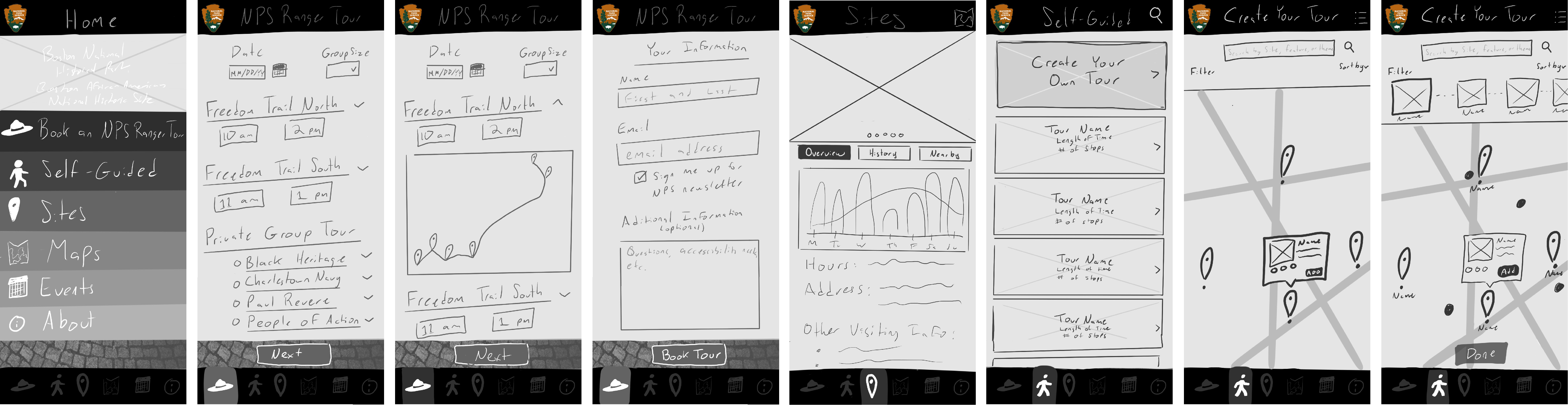
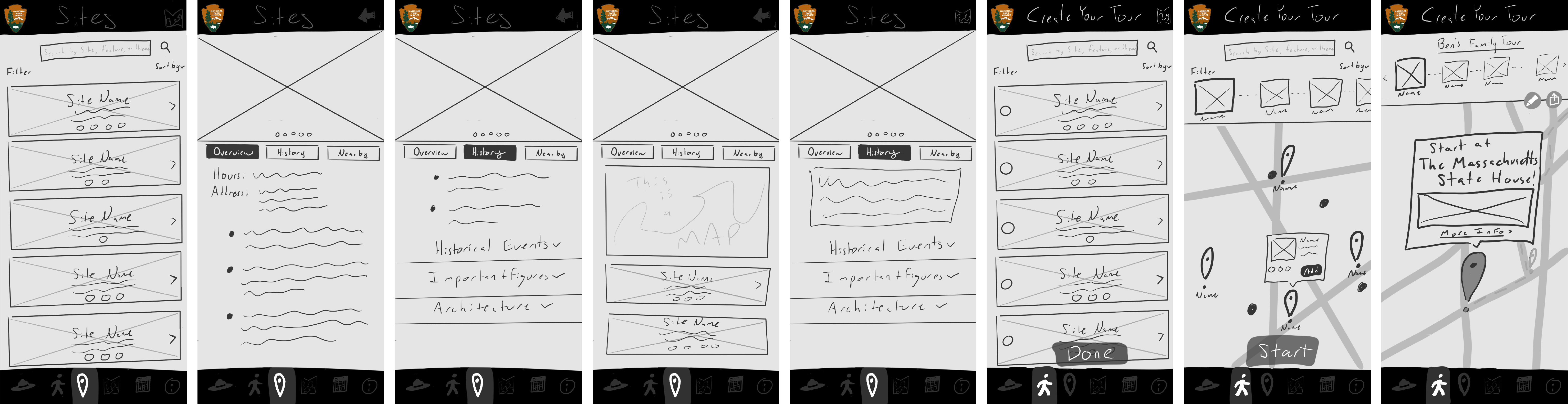
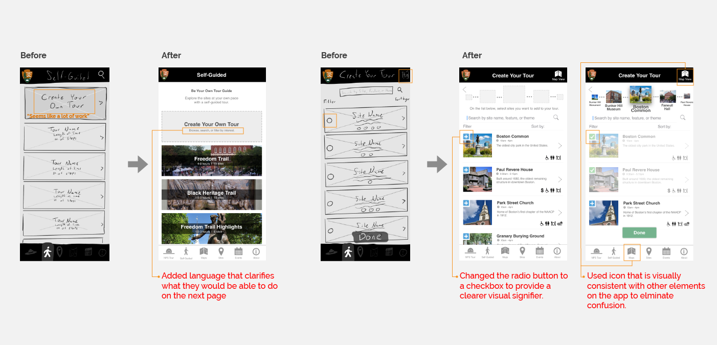
Using these ideas, we created wireframes to conduct our first round of usability tests. For the visuals, we wanted wanted to stay consistent with the branding of the existing application.
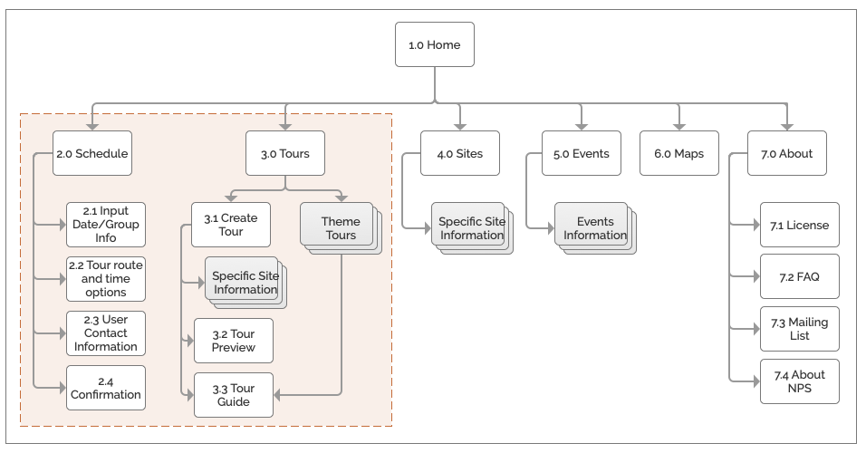
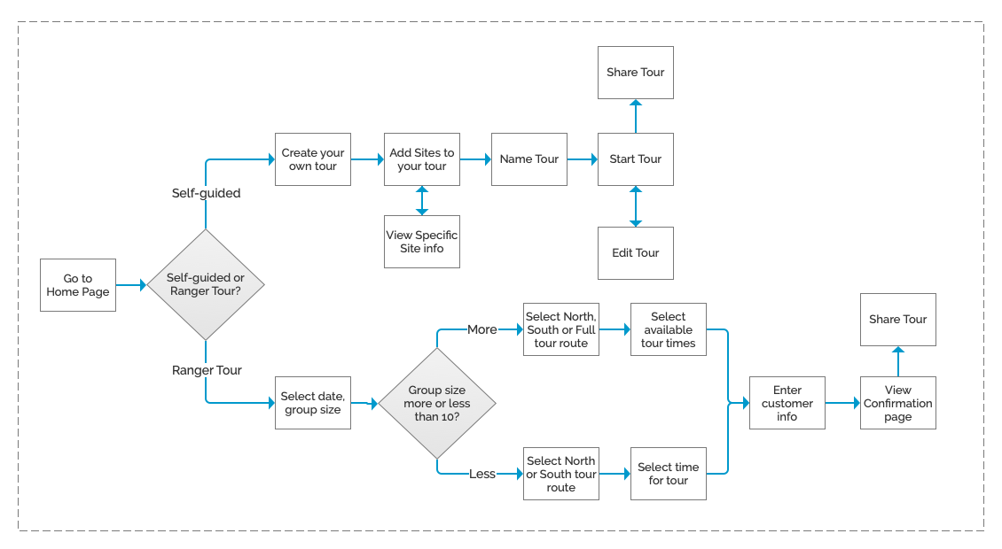
To narrow our project scope to fit the 2-week design sprint timeframe, we developed a Future State App Map and identified which portion of the application we were designing for.
Based on our sketches, we defined a clear user flow. With a more defined path, we created a higher fidelity design of the application.
Before getting to the higher fidelity prototype, we wanted to get our design out to the users as fast as we could. We created a clickable prototype with the wireframes to see how the users responded to our ideas.
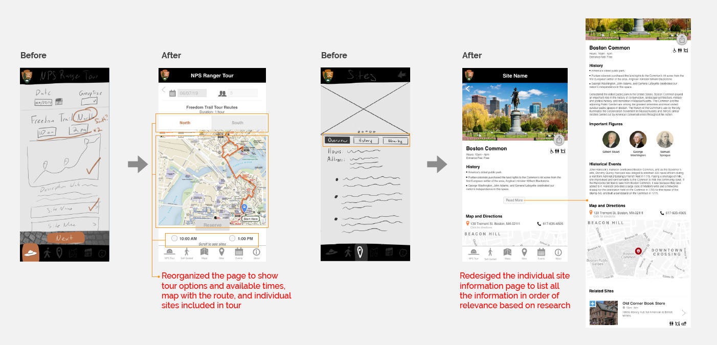
Enter your desired date and group size, and we will connect you with an NPS Ranger Tour guide
Launch PrototypeExplore the Freedom Trail sites at your own pace with a self-guided tour. You can also create your own tour based on your interest.
Launch PrototypeYou will learn so much from being at the site where your product is or will be used. Not to mention the awesome team bonding opportunity.
Have a solid Team/Project plan before starting a project with your team. Discuss how you will communicate with each other. Once you've built that understanding and trust with each other, you'll be amazed by the quality of work your team produces.
Your users will get confused if the visual language of your product is inconsistent. er stakeholders that you will have to talk to as well about

Last updated in September 2023
