
I led the user research and redesigned Red Wagon’s ecommerce website by identifying the user’s experience of browsing and shopping for babies, kids, and ladies clothing and gifts.
Red Wagon - Concept Design
2 week design sprint
Optimal Workshop, Adobe Photoshop, Axure
User Research, Information Architecture, Wireframing, User Testing
The Red Wagon is a casual, fun and unique boutique that sells clothing and gifts for babies, kids, and ladies. They want to expand and bring more traffic to the store. E-commerce shows a business opportunity that could help the Red Wagon reach their business goals.
From interviewing 5 people who shop for children's clothing or gifts both online and in stores, I identified 2 types of users and their frustrations with the experience of shopping for babies and kid’s clothes.

“I buy babies clothes online when I’m looking for something unique or personalized.”

“I usually buy my kids’ clothes online because I don’t have time to go to the store with my schedule.”
Does not have time to visit the store in person
Dislikes looking through irrelevant items while searching
Easy checkout and shipping process
Effective filter/search
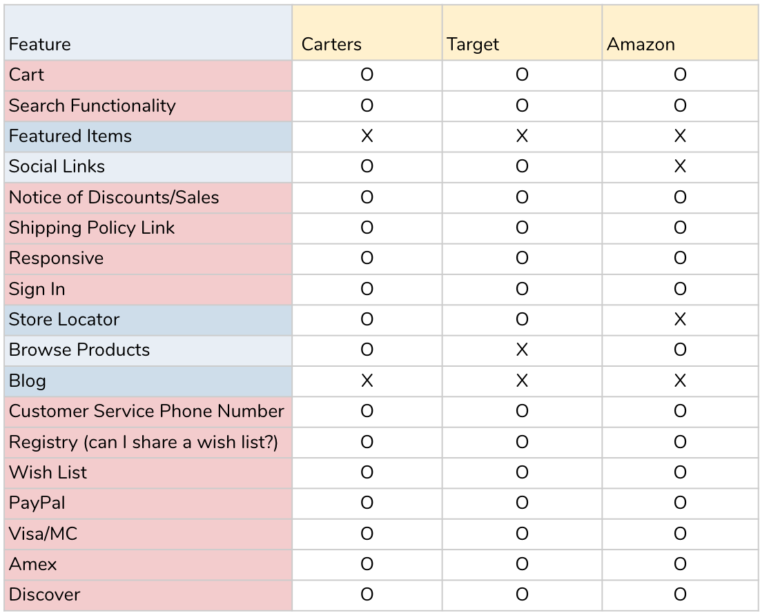
Before I started designing, I did a quick feature analysis of Carters, Target, and Amazon, which were identified as competitors during user interviews. I highlighted the features that existed in all 3 sites to give me a baseline on where I needed to start for the design.

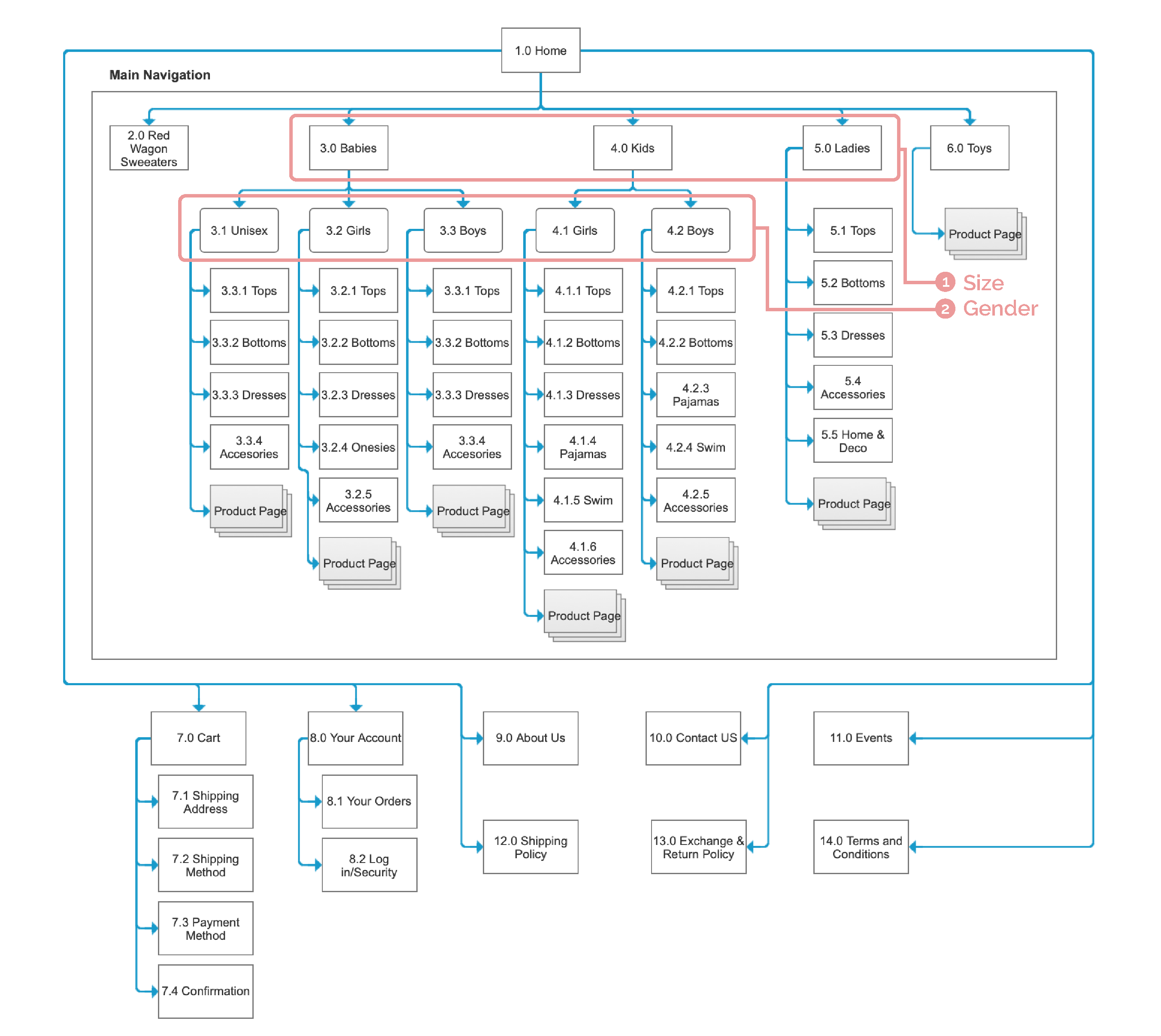
The store carries 500+ clothing items and 100+ toy/gift items. When recreating the store online, it is important that items can be found easily.
I took pictures of a sample of the items in the store (100 items) to see what categories users expect to organize these items.
Through an open card sort, I confirmed that my users follow the standard convention for organizing clothes. Users also tend to follow size then gender to categorize items. I used this as my foundation to build the navigation bar.
Once I established the organization of the content for the Ecommerce, I started thinking about the different tasks users will be doing on this website.
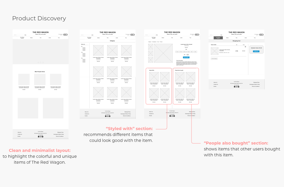
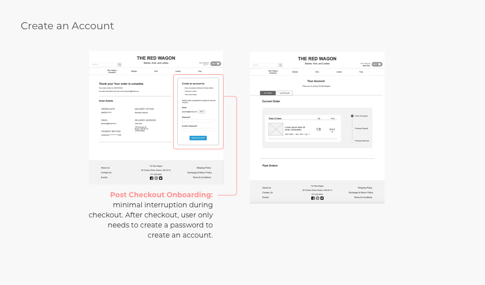
For this project, I wanted to define 3 user flows: Product Discover, Checkout, and Create an account.
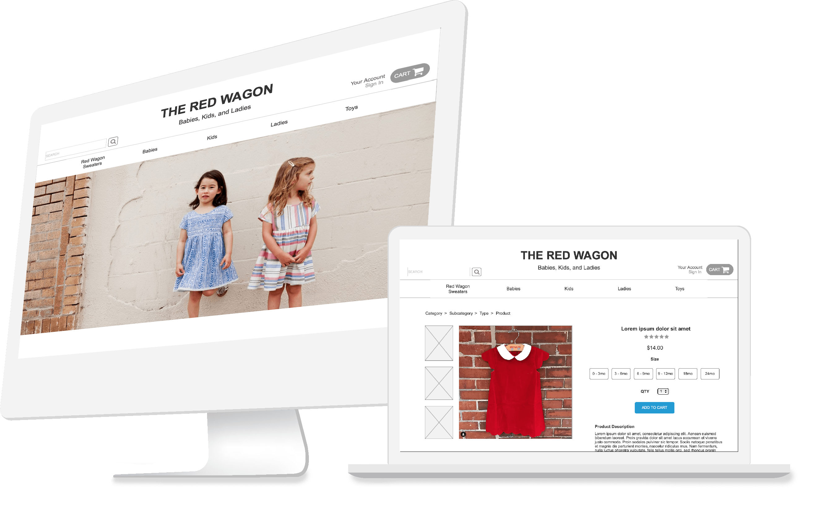
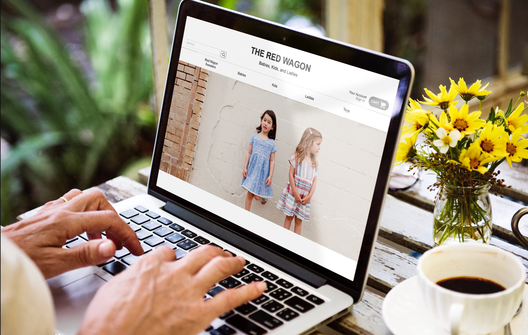
With a clear understanding of my users and a defined user flow, I sketched the basic outlines of the website redesign. Then, I incorporated user insights from my research into my design, which are highlighted in the wireframes below.
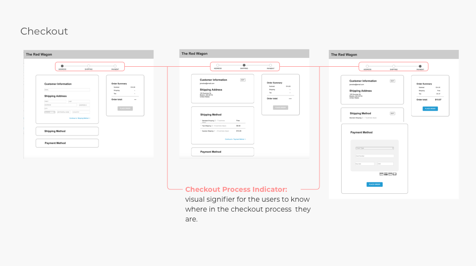
To verify if the design decisions were intuitive to our users, I conducted user tests were given scenarios and tasks to find items, purchase them, and create an account through the site. The two main areas that were confusing for the users were in the check out and on-boarding process.
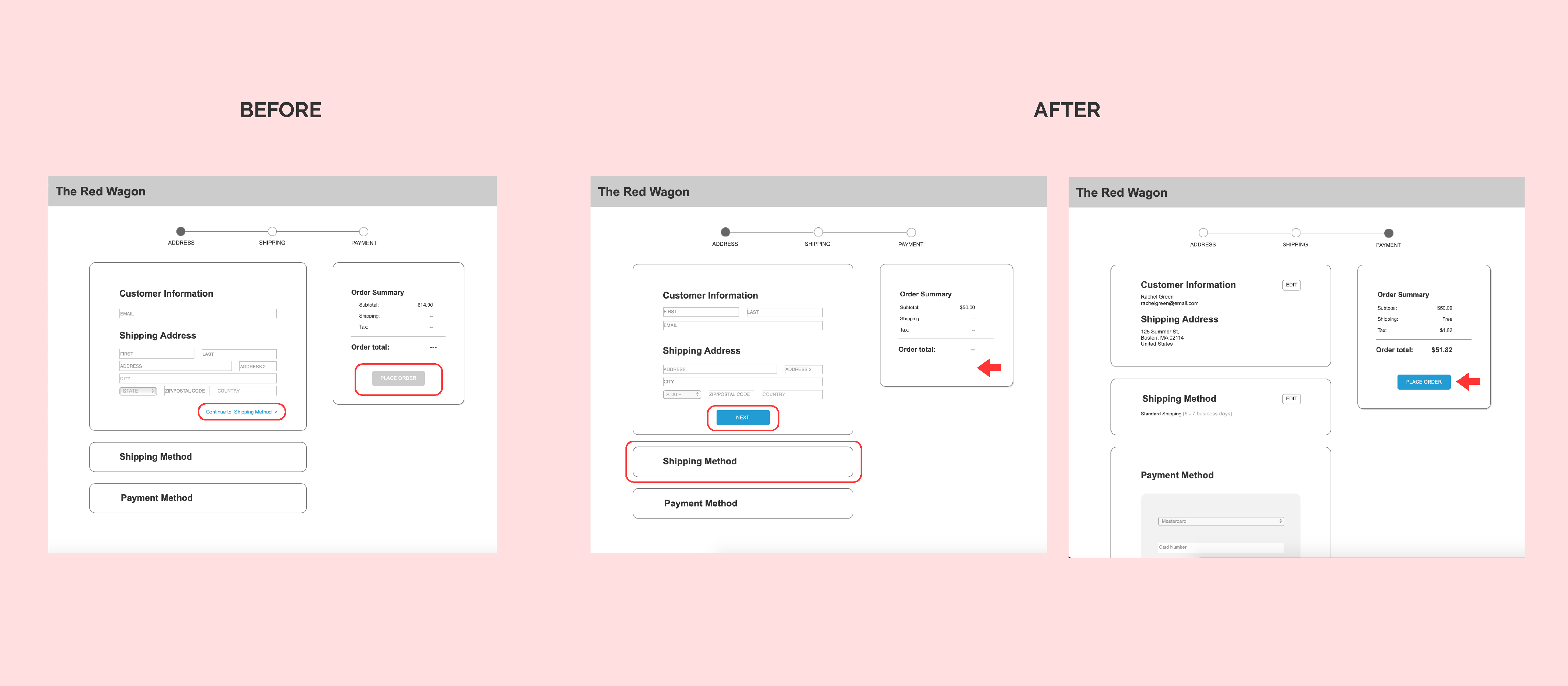
When users were going through the checkout process by filling out the forms, they did not notice the link to take them to the next step. Instead, they clicked on the tab below each form they were filling out. I improved this screen by allowing users to move to the next step by clicking on the tab as well as adding a CTA (call to action) button that has been consistently used throughout the site to progress to the next step.
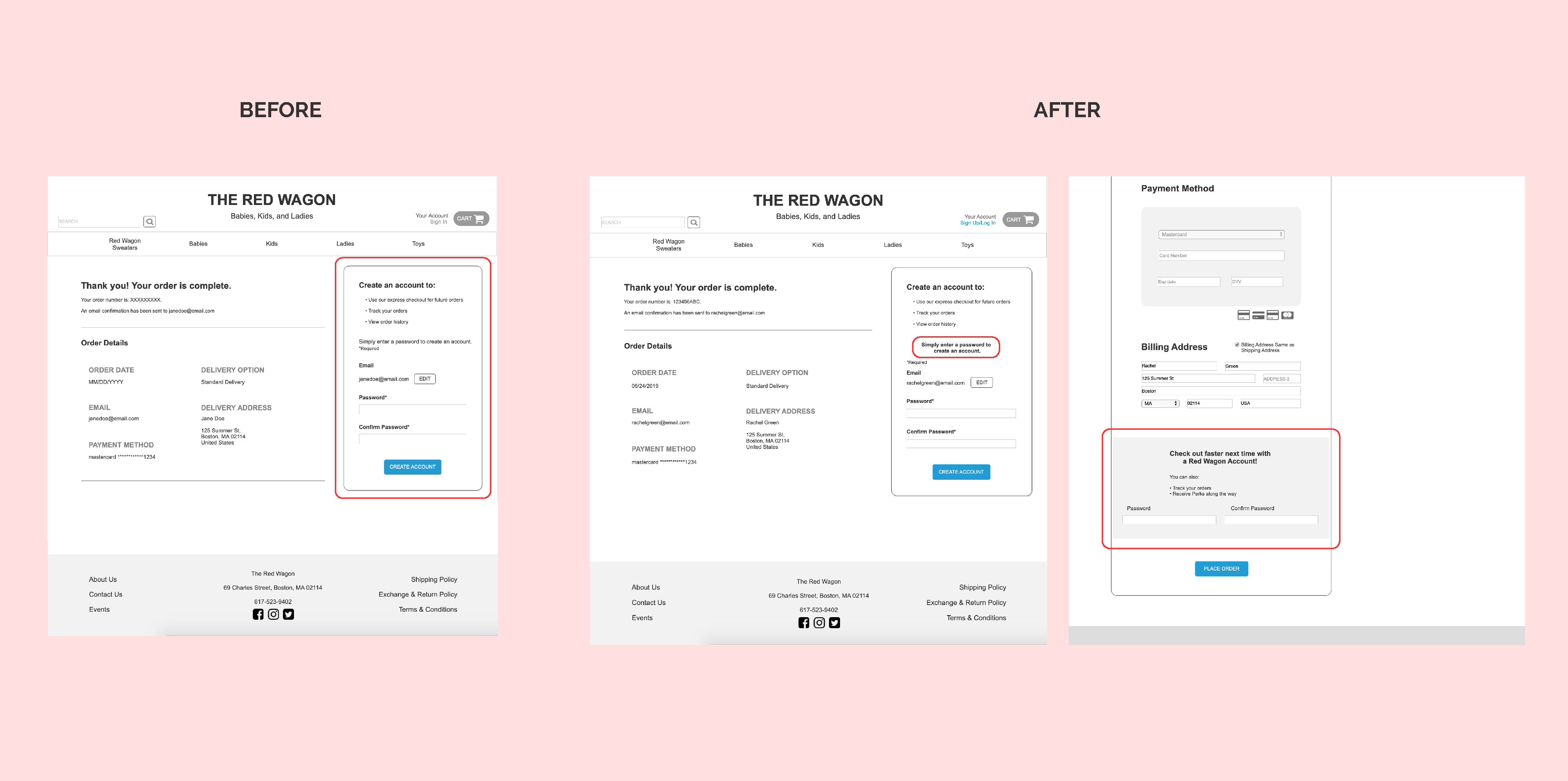
Users expressed their confusion about creating an account. While some did not notice the section on the confirmation page, some that noticed the section were confused as to why they were asked for a password. To eliminate the confusion, I gave the instructional text more hierarchy by bolding and increasing the text size.
I received feedback from the users that they would not want to fill out another form after completing their main task. I moved the on-boarding to be included as optional in the end of the checkout process with clearer instructions.
Don't make users feel bad by making the navigation hard to follow.
Keep testing your product because you will always get great user insight. Even areas you think may be obvious can be confusing for your users.
While creating your design, you will have to talk to stakeholders about the importance of UX and how it can help the them achieve their business goals.

Last updated in September 2023
